Passion for Promarkers Copyright Notice

The design work, text, photographs and videos on this site belong to ©Passion for Promarkers and each individual designer that contributes to this site. This information is shared to inspire you. All content on this site is not to be used for commercial purposes without explicit permission.
Please do not reproduce these articles in any way, mechanical or electronic for anything other than personal use only. But you may hyperlink to any of the articles giving due credit
Thank you!

Important

Weekend Workshops are published every Friday and all are available in PDF format so you can print out and keep them.

All workshops can be downloaded by clicking the small icon at the end of each post.


..........

Wednesday 30 September 2009

Weekend Workshop #17

Hello everyone, I hope you are all well and enjoying your week. We have a great tutorial from Debbi this week. If you would like to have one of your tutorials here on PFP for everyone to see or would like to do one especially for us, we are opening it up to everyone, so if you feel like you have something to share please email me :)
We also have a big thank you to  Sarah B and Caroline for being such fabulous guests. Look out on Tuesday for our next 2 guests :)

******************


We know how much storage for our pens is a problem, well Ida has found some fabulous storage at Camilla’s blog, Sue and myself (Gina) could not wait to have a go so here is my new storage


25092009687


Here is a closer look :)

25092009692
Now all you need is a

I must say it took me a while to do it and I have to thank Sue for the super idea of using Debbi’s PDF colour chart, but it is soooooo worth it, they look fabulous and stick out just enough to make them easy to get and put back.

Hugs Gina xxx


******************

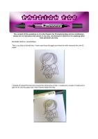
I think almost everyone has at least one animal stamp in their collection and so we have decided to do a series of tutorials on colouring animals with promarkers. I thought I'd start with a horse as its a popular theme, especially with little girls. I love this image; Charlotte's Horse from Whiff of Joy, designed by Alison Acton. Although its a cartoony type image it's also realistic in form and shape.
First things first, the image is stamped onto IQ Smooth 160 g/m2 with Memento Tuxedo Black ink. And I'll be using the following promarkers; Sandstone, Cinnamon, Cocoa and Umber. (I have also used Vanilla for the mane and tail which is not pictured)


The first thing I do is to imagine where the lightest bits would be, this is the bit that most people fin the most difficult to imagine. The easiest way to do it is probably to do an image search of horses on the internet. This is one that I found - it might look awfully complicated - but if you almost close your eyes, so that you are looking through your eyelashes, it is easier to see where the light and dark areas are.


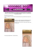
So I have started with the lightest areas and very roughly coloured these areas with Sandstone


Then I take a small section at a time and colour the remaining white bits with Cinnamon. Then blended using the Sandstone in small circular movements.


Next I take the Cocoa promarker and using small strokes, colour the darker areas. Then blend with Sandstone


The I repeat the above 2 steps (with the cinnamon, then cocoa) for each of the other small sections


I took the Umber promarker and added tiny shading to the darkest areas - the furthest away hind leg, and the back of the other three legs, and the shadow behind his jaw then blended with the Sandstone again.


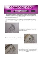
Then I moved onto his mane and tail. I coloured the areas that I imagined would be hit by the light source with Vanilla.


Then used Sandstone to colour the rest of the mane and tail and blended with the Vanilla


I kept adding more layers of Sandstone and blending with Vanilla until i was happy with the effect


And this is the completed image made into a card


******************


Hope you have enjoyed this weeks workshop, don’t forget if you want to join in and put a tutorial on, please contact me here


Hugs Gina, Denise and the DT xxx

Weekend Workshop #16

Blonde Hair Tutorial - Michele
This is my preference of colours to use for colouring blonde hair Ivory, Pastel Yellow, Gold and Cinnamon.
image
The image I've used is stamped onto white Data Copy Colour Printing paper 160gsm using Memento Tuxedo Black ink.
First of all, I go all over the hair in small circular motions using the colour Ivory.
image Then using very light strokes, I use Pastel Yellow
image
Now with the Gold ProMarker pen, go over the hair where you think it would be darker. Again using very light strokes.
image
Next I use the colour Cinnamon, where I think the hair would be darker.
Here's a little tip for you - don't throw away pens if they are running out.
I find these perfect for colouring hair, especially the darker colours.
image
Now with the Ivory ProMarker go over the whole of the hair using small circular motions.
image
Here is the image again fully coloured in.
******************
Blonde Hair Tutorial – Gina
This is my take on blonde hair, I have used Anya Snuggle and inked her with memento ink onto IQ paper.
25082009610
I started off using Primrose and covered the whole area of hair, I usually do a couple of coats just to get the ink into the paper and I find it blends better this way
25082009611
I then added Vanilla to the roots of her hair and the parts which I think are darkest, I do think that this is the hardest part deciding where is darkest, so I always do the roots the ends of the hair and then any where that hits an edge, i.e from a bow. I then go over the whole area again with the Primrose this blends in some of the Vanilla used
25082009612
I then moved on to Pastel Yellow, and again do the darkest areas but this time I use less than I did of the Vanilla, again I go over the whole area with Primrose
25082009613
I then go over the darker areas again to give it more depth but be careful not to overdo the darker areas as it will be harder to correct, once you are happy go over with the Primrose again just to blend in :)
25082009614
Hope that is of some help, like I always say the best way to learn is to practice yourselves and if you want to show us how you do it just drop us an email :)
Hugs Gina xxx
******************


coming up NEXT WEEK – Tutorial on colouring a Horse
Well we hope you have enjoyed the tutorials for this week, take care until next week :)
Hugs Gina, Denise and the DT xxx

Wednesday 16 September 2009

Weekend Workshop #15

I am so excited to be able to use the brand new promarker colours for my image tutorial this week. They arrived on Thursday morning, giving me just enough time to use them for Tuesday's challenge.
You'll have to wait until Tuesday to see the image made up into a card, and I hope you like what I've done.

First I stamped the image, Claudia the Artist from Sugar Nellie with Memento Tuxedo Black onto Stampin' Up whisper white cardstock


 The first colour I used was Blush, for all the skin areas


   I used on of the new colours Tan for areas of the skin that would be in shadow eg the right arm and just below the hem of her trousers and blended with the Blush


 I then coloured her trousers with another of the new colours, Mulberry, using a small circular motion


 I then added Plum to the areas of her trousers that would be in shadow and blended with the Mulberry.


 For her top I used Orchid, again colouring it with small circular movements


 I have added Purple to the areas that would be darkest, then blended


 Moving onto her belt/scarf, I used Pink Carnation to colour the whole area. I then used Fuchsia Pink for the shadows and blended again with the Pink Carnation (2 pics below)


 Moving onto her hair I used yet another of the new colours, Caramel. I coloured the areas that I wanted highlighted, where I imagined the light would hit.


 The second colour I used for the rest of her hair was Walnut.


 I blended this very lightly with the Caramel, I left the effect quite rough, to make it look like it has more texture.


 The I added Umber to the areas that wouldn't get any of the light e.g. the underneath of the hair on her right, the roots and ends.


 Again I blended this with the Caramel, roughly for more texture.


 For her accessories, bracelets, earrings etc I used Cerise. Then added Magenta from the old colours for the areas in shadow (pic below)


 Finally, this is the finished image, you will see how I've made it into a card on Tuesday morning for my challenge week where you can use any colour of promarker. 


Debbi xx