Passion for Promarkers Copyright Notice

The design work, text, photographs and videos on this site belong to ©Passion for Promarkers and each individual designer that contributes to this site. This information is shared to inspire you. All content on this site is not to be used for commercial purposes without explicit permission.
Please do not reproduce these articles in any way, mechanical or electronic for anything other than personal use only. But you may hyperlink to any of the articles giving due credit
Thank you!

Important

Weekend Workshops are published every Friday and all are available in PDF format so you can print out and keep them.

All workshops can be downloaded by clicking the small icon at the end of each post.


..........

Friday 26 March 2010

Weekend Workshop #39 Digi Friday

Another Friday is here so that means one thing, yes Digi Friday, before we begin the winner from last week winning some fabby images from Doodle Palace is


Can you please email Gina

This week our sponsor is Digital Delights, they will be giving away $10 worth of images to a random commenter, all you need to do is leave a comment it is as easy peasy at that.


CDS Logo Louby Loo Creations small Gift Certificate (2) Digital Delights New Badge Design final


Welcome to Digital Delights, a magical place filled with my little digi creations from all walks of life. We have a wide range of digital stamps which are delivered straight to your email 24/7!!


Wendy also has her own line of Clear Acrylic stamps at Clear Dollar Stamps.


Now for this weeks tutorial. This tutorial is done by yours truly, Gina and will show you how to add text to a digi image, the image I have used is “Elvin the Toad Background” from Digital Delights, it is a perfect image to add a greeting to,

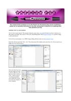
First of all you need gimp, it is a FREE image editing software and you can download it here,

Open the software and click “File - New” then drop down the template menu and chose A4. (If you need to see bigger pics just click on them.)
1
Now you need to go and find the image you want to edit or add text to, for this you need to click on “File – Open as layers”. You then go and find your image from where you store your images on your computer
2
You should see something similar to the picture below, but of course with your own image. Now if you print the image as it comes it may be too large and waste too much paper (you know what us crafters are like). So firstly we want to scale the picture down, for this hover over the 4th button down on the left hand side of your toolbox, it should say Scale Tool, click and then click on your image
3
This is what you should now be seeing, at the bottom of the toolbox you should tick the box “keep aspect” this means you will not lose the shape of your image. Each corner of the image has a square, click and drag the corner to the size you would like the image, don’t forget you have rulers to give sizes on the sides.
5
Once you have the size you require click on “move tool” which is located on your toolbox 2nd in and 3rd icon down. Now you can move your image anywhere on the page to save space
6
When you are happy with the location of your image “File – Print”, select your printer and print… be careful to make sure the paper is lined up properly, you will see why later on.
7

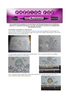
Ok now here you must put down which way your paper has come out of the printer, I just put an arrow with which way it goes back in. Now go colour in your image

24032010905

I like to zoom in at this point to see my image better, click “View – Zoom – Zoom in” the more you want to zoom the more you do it
8
Now for the wording, you maybe wondering why I have not done the wording already……..well, I have tried it both ways and when I printed off the wording and then coloured in the image the wording bled and ruined the image, this way the wording goes on top of the colouring and does not bleed at all.
Click on the large black A button which is the “Text tool”
9
Down the middle of the tool box there is a AA which is all of your fonts, here is where you choose which font you want to use and also the size of font. I used Yearbook solid and the size of text was 85 px,
10
Move to the area you want to add text and click, there is a little GIMP text editor box that shows itself, click the “use selected font” box so you can see which font you are using and in the text box write the wording you want, you will then see the wording show up in your area on your image, once you are happy close the text box, you don’t need to worry that it is in the correct place, we will sort that out in a few pics :)
11
Now on this image I have chosen I want a slight slant to the wording so click on the icon above the big black A (text tool), this is the rotate tool,
12
Click on the text you have just done, making sure you have a dotted line around the text, you should see something similar to below. Now to move the wording to a slant hold down your left button on mouse and move, it is very sensitive but don’t worry about that, once you think you have the correct position click rotate on the box that appeared near your image, if the box is ever in the way just hold your left button down and click on the box to move.
13
If you are still not happy with the location of the wording use your “Move tool” again which is located in the tool box, click the text you want to move, again make sure you have a small dotted line around the text. Left button down and drag the text to where you want it to go
14
Just repeat the above instructions for the Birthday and Name
15
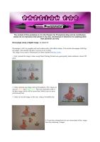
Put your paper with your coloured image back into the printer the correct way up and print again, if you have been careful you should have a perfect match

24032010907
Here is the finished image, of course I still have some colouring to do.
24032010908
I do hope I have not bored you to tears, I know it looks very long winded but it really does only take a few minutes to do and with the personalisation of the image I think is really effective.
Don’t forget to leave a comment to win some gorgeous images from Digital Delights, they really do have some stunning images and check out Tuesdays challenge to see my card
Thanks for looking


Hugs Gina xxx

Friday 19 March 2010

Weekend Workshop #38 - Digi Friday

Hi there and welcome to another Weekend Workshop, thankyou to everyone who entered last week's Digi Friday giveaway, and thankyou also for all the lovely comments about Debbi's tutorial, we can't wait to see her colouring tips being put to good use.
So, before we get on to this week's tutorial and sponsor, you'll want to know who won the fab prize from Fred, She Said.... so the randomly chosen winner is ....


congratulations, please email Debbi so she can sort out your prize for you.

So this week our fab sponsor is Doodle Palace and Denise has done a super cute colouring tutorial for you

Prize details to follow

So without further ado, over to Denise for her tut.

For my Digi Friday tutorial today I am using a super cute image by Doodle Palace called ‘bunnies & strawberries’
I have printed my image out using my Epson inkjet printer onto 225gsm smooth white card.  You can click on the pictures for a closer look.
This is the image before I begin colouring with my promarkers (see how cute it is):
001
In the first picture I have completely coloured the leaves with meadow green and the strawberries with red:
002
Next I add shading with apple on the leaves and berry red on the strawberries.  Don’t panic if you think it looks too harsh when blended it will look fine:
003
Then I added a touch of leaf green to the leaves and ruby to the strawberries for added depth before blending them all together with my original colours (meadow green and red):
004
As I wanted to keep my bunnies white I just added highlights with ice grey 1 and shaded their ears with pastel pink:
005
My next job was to colour the ground with meadow green and I added shading with apple:
006
I did the same for the sky with powder blue and shaded with pastel blue (once again don’t worry if it looks a little ‘blotchy’ it will even out once blended):
007
Finally I blended the ground and the sky with the original colours (meadow green and powder blue):
008
As I will be cutting out the image I didn’t colour the whole of the background in.  If you want to add clouds you could blend out some of the colour with your blender pen.  I hope you have enjoyed my tutorial - don’t forget to check back on Tuesday when I will be using this image on my card.
Hugs, Denise x


So remember, to be in with a chance of winning some digi images from Doodle Palace,  all you have to do is leave a comment on this post and we'll pick a winner when we publish the next Digi Friday. We'd love it if you helped to spread the word, but it's not necessary to be counted in the draw.

See You all again next week for Gina's fab tutorial and a brand new sponsor.
Hugs, Denise, Gina & DT x x

Friday 12 March 2010

Weekend Workshop #37 - Digi Friday

Hi there and welcome to another Weekend Workshop, thankyou to everyone who entered last week's Digi Friday giveaway, and thankyou also for all the lovely comments about Sarah's tutorials, we can't wait to see all your decoupage and shrink plastic creations.
So, before we get on to this week's tutorial and sponsor, you'll be wanting to know who won the fab prize from Bee Crafty.... well the randomly chosen winner is ....


congratulations, please email Debbi so she can sort out your prize for you.

This week we have another fabulous prize from our sponsor Fred She Said, and it's Debbi's turn to use one of their images for her tutorial.
Photobucket
You could win  $15 to spend in the Fred She Said online store and all you need to do is leave a comment on this post. We'd also appreciate it if you helped to spread the word, but it's not compulsory.

Now, over to Debbi for her image tutorial...


I have used the "Smelling the Cherry Blossoms" set from Fred She Said, and printed one of the images with background and a few of the cherry blossom images onto a sheet of SU Whisper White cardstock. I have an HP Photosmart printer and use regular HP ink)


I coloured small circles of Pale Pink for the wee girl's cheeks,


Then covered all the skin areas with Blush, blending with the Pale Pink over her cheeks


Next, I coloured her hair, starting with Caramel which I used all over - leaving a small area white. This is where I imagine the light would be shining onto.


Then I used Cocoa to cover the whole area - apart from the white area and a small area of the Caramel


The next shade I used was Walnut, which I used on the darkest areas of her hair ie: at the roots and ends.


I went back over all the coloured areas of the hair to blend with Caramel


To colour her kimono, I coloured it using small circular motions over the whole area with Meadow Green, then used small marks of Apple where I imagine the shadowed areas would be. I used the Meadow Green again to blend the darker areas.


I then coloured the kimono trim and her obi (that's the sash of a kimono) with Arctic Blue, laying down more layers for the shaded areas


Moving onto the cherry blossoms, I first dotted some Aubergine into the centres, then blended outwards onto the petals with Pink Carnation


To colour the wall I used Warm Grey 3 and 4, and added some Tan to the stones to give them a bit more texture


And to finish off the background, I used Lilac and Amethyst to colour the mountains, Leaf Green, Apple and Meadow Green for the grass, Leaf Green, Umber and Caramel for the trees and Cool Grey 3 to add a bit of shadow to her tabi socks.

I'll be using this image on my DT card this Tuesday, so look out for it.
Debbi
x

Friday 5 March 2010

Weekend Workshop #36 - Digi Friday

Welcome back to Digi Friday here at the Weekend Workshops of Passion for Promarkers. And can we just say WOW at the response we got over the last week to our very first Digi Friday tutorial. So before we reveal the next Digi Friday Tutorial and Prize Draw, I'm sure you're itching to hear who has won the fabulous $15 gift voucher for Soft Pencil, drum roll please............. it's............


Congratulations, and if you email Debbi, she'll get you sorted out with your prize.

So do you all want another chance to win?

This week, our sponsor at Digi Friday is Bee Crafty and our GDT, Sarah W has put together a double whammy tutorial for you using one of the gorgeous images from there.

The prize is any 3 Bee Crafty images (or a Set or PDF), all you need to do is leave a comment on this post and we'll randomly choose a winner from all the comments next Friday.

So, over to Sarah and her tutorials featuring one of the Bee Crafty images...


Decoupage using a Digital image

Decoupage is still very popular and can be done easily with rubber stamps. You can also decoupage with Digital images. This tutorial will show you how to do it easily.
The image I have used is Whimsical Girl Heart Garden from Bee Crafty.
 
1. First I printed the image 4 times using Photo Printing Wizard onto good quality white cardstock ( about 250 gsm)


2. I then coloured one image with my Promarkers. My 2 main colours are Mango and Bright Green. This isn't necessary as this is the base image which will be layered but I think it gives a more professional look.


3. I then cut out the image, in this case  using a Nestability die.


4. I have then coloured and cut out various parts of the  image from the remaining 3 images.


4. Here is a close up of the cut out images.


5. If you don't have many Promarkers and want to use shading on your images you can go over your colouring with the same colour to deepen it. In this case I have gone over the Mango with the same Mango pen on the left side of the image. I have done the same with the Bright Green. This will give the shaded effect


6. I have layered the pieces on top of each other with foam pads.


7. Next I have used Glossy accents over the heart shape flowers and sprinkled tiny yellow accent beads. The Glossy accents is clear and will act as a glue to hold the beads in place.


And there you have a decoupaged image made from a digital image.


Digital image on Shrink plastic and coloured with Promarkers.

1. I have also printed the image directly on to Shrink plastic. Be careful when handling this though as the ink stays wet.


2. Colour in the image taking care not to touch the print as it will smudge. Your colouring with Promarkers doesn't have to be good here! Don't use very dark colours as the colours you use intensify when the image is shrunk. Punch a hole in the Shrink plastic if you wish to attach it to your project with a brad or to thread ribbon through.


3. Finally shrink it with a Heat gun. You now have a small "tile" to attach to your project


Sarah