Passion for Promarkers Copyright Notice

The design work, text, photographs and videos on this site belong to ©Passion for Promarkers and each individual designer that contributes to this site. This information is shared to inspire you. All content on this site is not to be used for commercial purposes without explicit permission.
Please do not reproduce these articles in any way, mechanical or electronic for anything other than personal use only. But you may hyperlink to any of the articles giving due credit
Thank you!

Important

Weekend Workshops are published every Friday and all are available in PDF format so you can print out and keep them.

All workshops can be downloaded by clicking the small icon at the end of each post.


..........

Friday, 29 January 2010

Weekend Workshop #31

My goodness that's been another super quick week, and that's nearly January over and done with - where on earth does the time go?

Sarah has done this week's workshop for you and there's a wee clue as to the theme for next week's challenge here. But you don't need to worry about that too much until Tuesday as the current challenge doesn't finish til 9am on Tuesday 2nd Feb. As always, we've been bowled over with the fabulous entries - you all seem to love the Pastel Green and Blossom colour combo as much as we did. So if you haven't entered yet, give it a try.

So, we'll leave you in Sarah's capable hands now...


Colouring Animals Tutorial for Passion for Promarkers by Sarah Horne
Materials required:
·         Bleed resistant cardstock – I use Stampin Up Whisper white cardstock as it is the best I have found so far.
·         Black Bleed resistant Ink such as Impress or Memento
·         White Ink Essentials pen
·         Promarkers – Ice grey 1,3 & 5 & Pastel pink
·         Magnolia Elephant & Acrylic block


1.      Stamp the image onto the cardstock


1.      For this tutorial I have done the shading first so it is clearer to see, this image in particular has markings that help indicate where the shadows will lie – I have used Ice Grey 5 as my darkest colour as follows:

1.      I used Ice Grey 3 next, at this stage I have not blended ~ I have simply just laid down the colour next to the darkest shade.


1.      Next I gave the elephant rosy cheeks with the Pastel pink pen


1.      Next I used the Ice Grey 1 pen to blend all the colours together, even the rosy cheeks. I went over the darker colours with small circular motions and removed all the harsh lines……..this will lighten your darker colours so you can add some more shadowing using Ice grey 1 to remove harsh lines as before


1.      Finally I added some highlights to his cheeks and toes with a white Ink Essentials pen ~ sorry photo not that great for this stage


 I hope you enjoyed my tutorial and you were able to take something from it.
Sarah
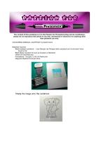

Thankyou Sarah, isn't that just the cutest elephant ever? So have you figured out what the theme for the next challenge will be? Don't worry, all will be revealed at 9am this Tuesday, although I can tell you that you can use ANY COLOURS of promarkers.

Coming up next week...Sue will be sharing a fabulous tutorial with us.

Hugs,
Gina, Denise & DT x x

Saturday, 23 January 2010

Weekend Workshop #30

Woops, sorry folks - lost track of the days there! But the fabulous Sepia tutorial from Caryn is well worth the wait, so without any further ado, I'll hand over to the fabulous Caryn...

This week I have chosen to show you how I colour an image to give a sepia effect using ProMarkers in shades of brown.  I am using this gorgeous Chickadee image from Funky Kits and have stamped her with Memento  Tuxedo Black ink onto Stampin Up Whisper White card.  This is just the colour combination I have chosen to use but a similar effect could be gained using whatever shades from the brown range you may have.
I start by colouring the entire image with a layer of Satin.

I then use Pastel Beige to start adding definition in the shadowy parts such as the roots of the hair and the folds of the fabric.  I continue with this using Sandstone to deepen the colour a little.
  
To give the hair a darker tone and to distinguish it from the rest of the image I add Cinnamon to the darker parts.  At this stage I then go over the whole image with the Satin to smooth out and blend any harsh lines.

My next step is to add a bit of warmth to the image using Caramel, again in the darker parts of the image and then blend again with Satin.

Finally I add tiny touches of Umber to define the shadows and go over any remaining hard lines with the Satin again.

 
Well as I say, this is just one way of achieving a vintage sepia effect but there are so many shades available across the Brown spectrum.  It’s a case of experimenting with what you’ve got but the final effect will be very striking and perfect for when you want a vintage look to your card.  Hope this has been helpful to some of you.
Big hugs,
Caryn xxxx

Isn't that just a stunning effect? we'd love to see how you get on with this technique.


Next week we have a Sarah's elephant image tutorial coming up

Hugs
Gina, Denise and the DT xx

Friday, 15 January 2010

Weekend Workshop #29

Hi there and welcome to this week's ww. We hope you're not all snowed in - but at least on the bright side of that it gives us more time to craft eh?

Maria has done a fabulous image tutorial for us this week, using one of the Gorjuss Girl stamps from Sugar Nellie.
But before we get to that, remember there is still plenty of time until 9am Tuesday to get your entries in for this week's challenge and the prize is 2 Sugar Nellie stamps.

So, over to Maria...

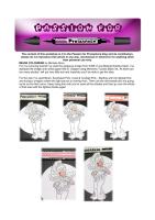
For my colouring tutorial I chose a palette of pink and green Promarkers, as well as skin and hair tones, including Ivory, Blush, Pastel Pink, Pale Pink, Baby Pink, Cocktail Pink, Antique Pink, Meadow Green, Leaf Green, Chestnut, Umber, and a Blender.

I started by colouring her face and arms with an Ivory base coat.


Pic 1


Then I added Blush to the area that would naturally be in shade.

Pic 2
I added a touch of blush with Pale Pink on her cheeks…

Pic 3

And blended all the coloured areas with Ivory.

Pic 4
I coloured her dress firstly with Pale Pink, then added shadow with Baby Pink.
Pics 5 and 6
I used a darker shade of pink, Cocktail Pink, for extra definition, and blended all the colours with Pale Pink.
Pics 7 and 8
I coloured the hearts on her dress and her hair ornament with Antique Pink, and then coloured the edges of her wings and her waistband with Meadow Green, with Leaf Green for a touch of shading. I used the Blender to soften the lines of green on her wings, and I coloured her tights with pink and green to match her dress.
Pics 9 and 10
Finally, I coloured her hair, first with Chestnut all over, followed by the darker areas (using the inked image as a guide) with Umber, and finally blended it all with Chestnut once again.
Pic 11

I hope that you've enjoyed my tutorial! Please drop by again on Tuesday to see my finished card and all the fabulous ones made by the rest of the Design Team.
Maria xx


Next week we have a sepia tutorial from the fabulous Caryn

Hugs
Gina, Denise and the DT xx

Friday, 8 January 2010

Weekend Workshop #28

Welcome to another WW, and this time we have a masking tutorial from one of our guest designers, Sam.
So without any further ado...
 

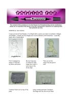
I used card-stock from Rymans, it is Bright white coated card, which is available in 160gsm and 200gsm.  I usually use the 160gsm and it works fantastic with Promarkers.  I used Memento ink in Tuxedo Black.
 First I stamped the Tilda image onto the card

 
My next step was to stamp the same image onto a post it note close to the sticky edge


Then cut out the image from the post it note 

I wanted Tilda to sit on top of the piano


Using a stamp positioner I stamped the piano image onto the thin acrylic sheet


I placed the stamp                    I removed the thin                    When the post it

positioner over the                   acrylic sheet containing             note is removed Tilda

stamped image of Tilda             my image and stamped            looks as though she is

so she looked as though             the piano in its place                 sitting on top of the 

she was sitting on the piano                                                                 piano.


The finished image coloured ready to go on my card...


Well, that was a super tutorial that'll work for lots of things - girls on swings, sitting on benches, chairs etc.


Next week we have an image tutorial from the fabulous Maria

Hugs
Gina, Denise and the DT xx


Friday, 1 January 2010

Weekend Workshop #27

Happy New Year everyone, all the team here at PfP would like to wish you all a very healthy, happy, prosperous and of course crafty 2010.
To kick off the new year we have a super image tutorial from Michele who has chosen the theme for the challenge that starts on Tuesday 5th January.

There's still a little time to enter our Xmas Extravaganza before 9am on Tuesday - there are lots of fabulous prizes to be won.

Over to Michele...
image


For my colouring tutorial I've used the gorgeous image from Whiff of Joy Melinda Holding Heart. I've stamped the image onto white paper that is 120gsm using Memento Tuxedo Black ink. As there are too many photos I will put very little text and hopefully you'll be able to get the idea.


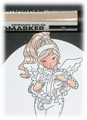
For the skin I've used Blush, Sunkissed Pink, Coral & Cocktail Pink - Starting with the lightest first and trying to imagine where the light source is coming from. Then use the next shade and not going as far as the first colour. Keep doing this until you've used all the shades and then go over the whole of that area with the lightest shade again.


image image image image image


For the hair I've used Tan, Cocoa & Chestnut. Then gone all over it again using Almond


image


imageimage image


 For the trousers I've used Tan, Cocoa & Chestnut. Then gone all over it again using Almond


image
image image image


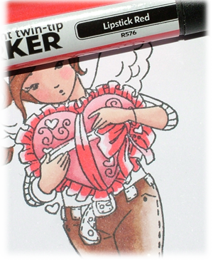
For the cushion I've used Baby Pink, Cocktail Pink & Antique Pink. Then I've gone over the whole area again with Baby Pink.


image image
image image


For the ribbon and frill of the cushion I've used Baby Pink, Lipstick Red & Crimson. Then going over all of the area again with Baby Pink.


image image
image image
image image
image


Hugs Michele x 
To see how the image looks on Michele's card you'll have to wait until Tuesday.


Coming up next week: Sarah show's us how to colour a fabulous Lion

Hugs
Gina, Denise and the DT xx